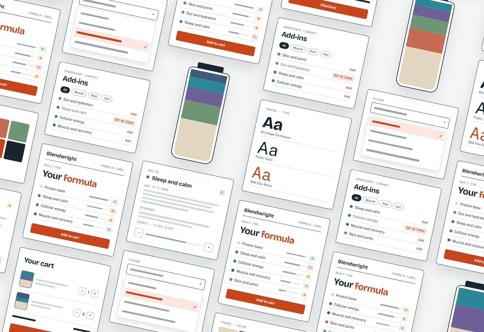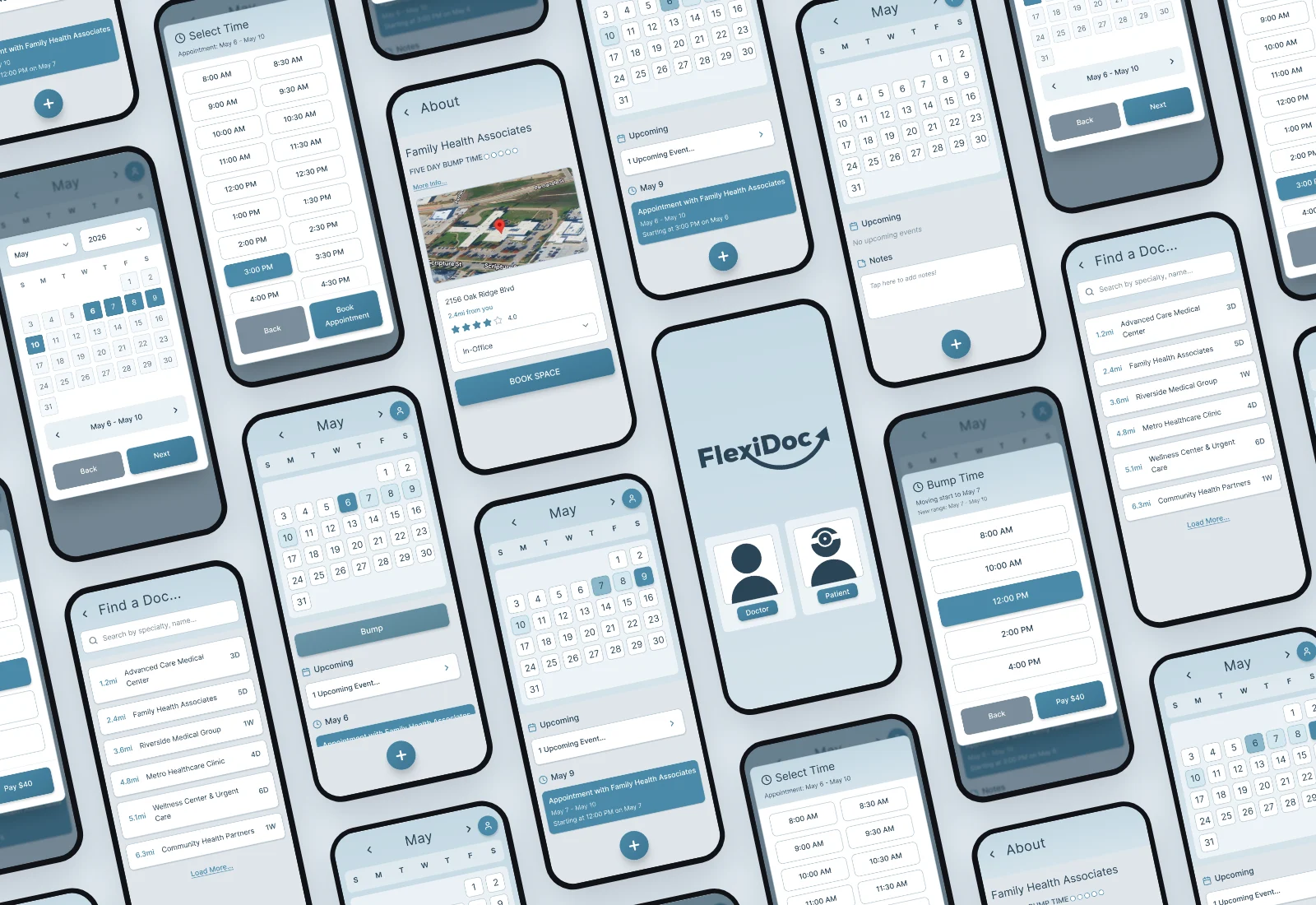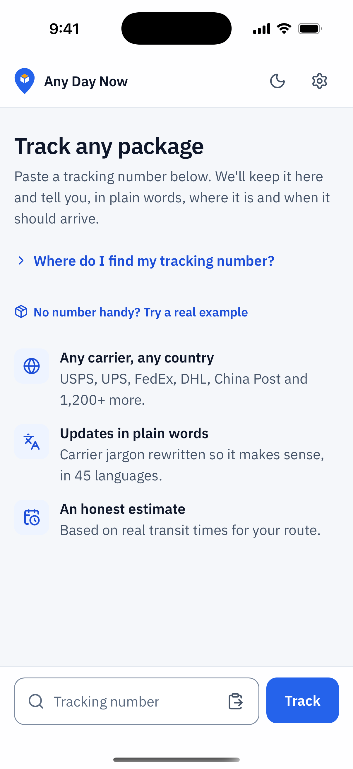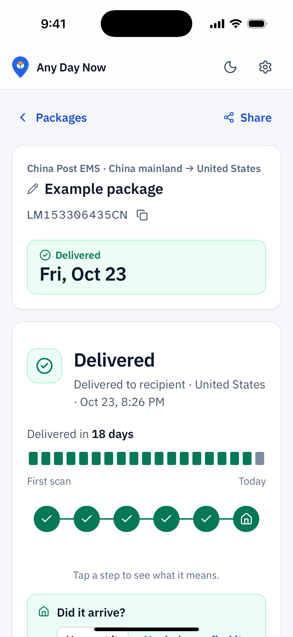
Tracking pages speak carrier
A typical tracking page lists scans like "Handed over to import customs" and "Destination customs allow Import", then leaves the expected delivery date blank. The person waiting is left to decode it, and the moments that worry people most, a package sitting in customs or a scan that hasn't changed in days, are exactly where the page says the least.
Customs is also where scam texts land, asking people to pay a fake import fee. And a lot of people ordering from overseas don't read English first, so even the clear scans aren't clear to them.
Where is it?
Every scan, rewritten in plain words, with a line on what it means.
When will it arrive?
One honest delivery estimate, explained, instead of a blank field or a date that keeps slipping.
Is this normal?
Context at the anxious moments, including how real customs fees are requested.
Live in a day
The first version went live on October 19, the same day as the first commit. It identifies the carrier from the tracking number's format and asks the official USPS, UPS, FedEx and DHL services first, falling back to an aggregator for everyone else. Each scan is then rewritten in the visitor's language.
The delivery estimate is the part I care most about getting right. It uses the carrier's own date when there is one. When there isn't, it uses real transit times for that route once ten or more packages have been delivered on it, and published carrier standards before that. Delivered packages feed the model with stage durations only; the tracking number itself is stored as a hash.
Auditing my own work
The day after launch I audited the site against Nielsen's ten heuristics and Krug's trunk test. It worked, but it buried its two answers, where the package is and when it will arrive, under a five-line summary set as a headline. Its dark serif and monospace styling read like a template rather than a utility people could trust.
The redesign led with a short status headline and the estimate, moved to a light-first system with dark mode following the device, and gave color a fixed meaning: blue for action, amber for attention, green for delivered, red for a problem, always paired with text.
- 6 to 9Heuristic score out of 10, before and after the redesign
- 2 to 0Major (severity 3) issues
- 13 to 0Minor (severity 2) issues
Three rounds, ten user groups
From there I ran each change through three audits: accessibility against WCAG 2.2 AA, a heuristic review, and a task-based usability review. Every finding is rated on Nielsen's 0 to 4 severity scale and tagged with the user groups it affects, from first-time trackers and older adults to screen-reader users, people with color vision deficiency, non-English and right-to-left readers, and resellers tracking dozens of parcels.
The first round, on the live site, surfaced things like translated updates being read aloud with an English voice, near-invisible empty steps in the progress bar, and a language picker that listed "Spanish" instead of "Español". Round two covered the home screen redesign and round three the details that make the web app feel native. Across all three audits, major findings went from twelve to two to none.
Round 1 Live site, October 21
Round 2 Home screen redesign
Eight ways to say "today"
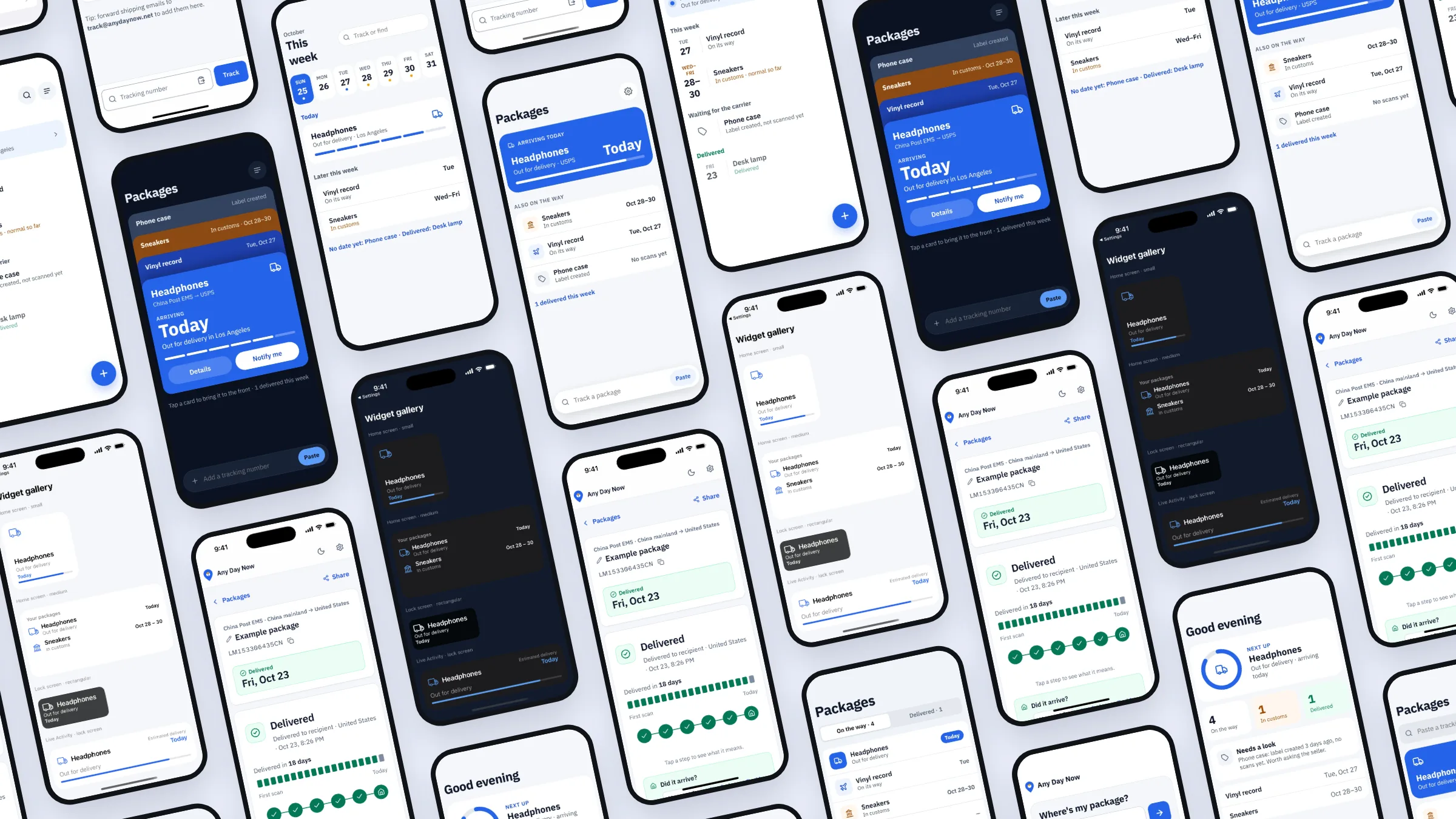
The home screen has one job: show what's arriving and when, at a glance. I explored eight directions with the same five packages so they could be compared fairly: a hero card for whatever arrives today, a two-column grid, a timeline grouped by arrival day, segmented tabs, a stacked card deck, a filterable list, a week strip and a dashboard with counts.
The shipped home combines the strongest parts: tabs for on the way and delivered, rows grouped by arrival day, and the tracking field always in reach.
An icon that survives 16 pixels
I drew ten app icon concepts, each built on one idea: a porch light left on, a parcel as the crown of a clock, a calendar check, a route ending at a door, a sunrise, a monogram, an hourglass, a front door, a pin holding a box, and the tracker's own step dots.
Every concept is shown at 64, 32 and 16 pixels next to the full-size version, because an icon that only works large fails on a home screen, in a browser tab and in a notification.
Beyond the browser
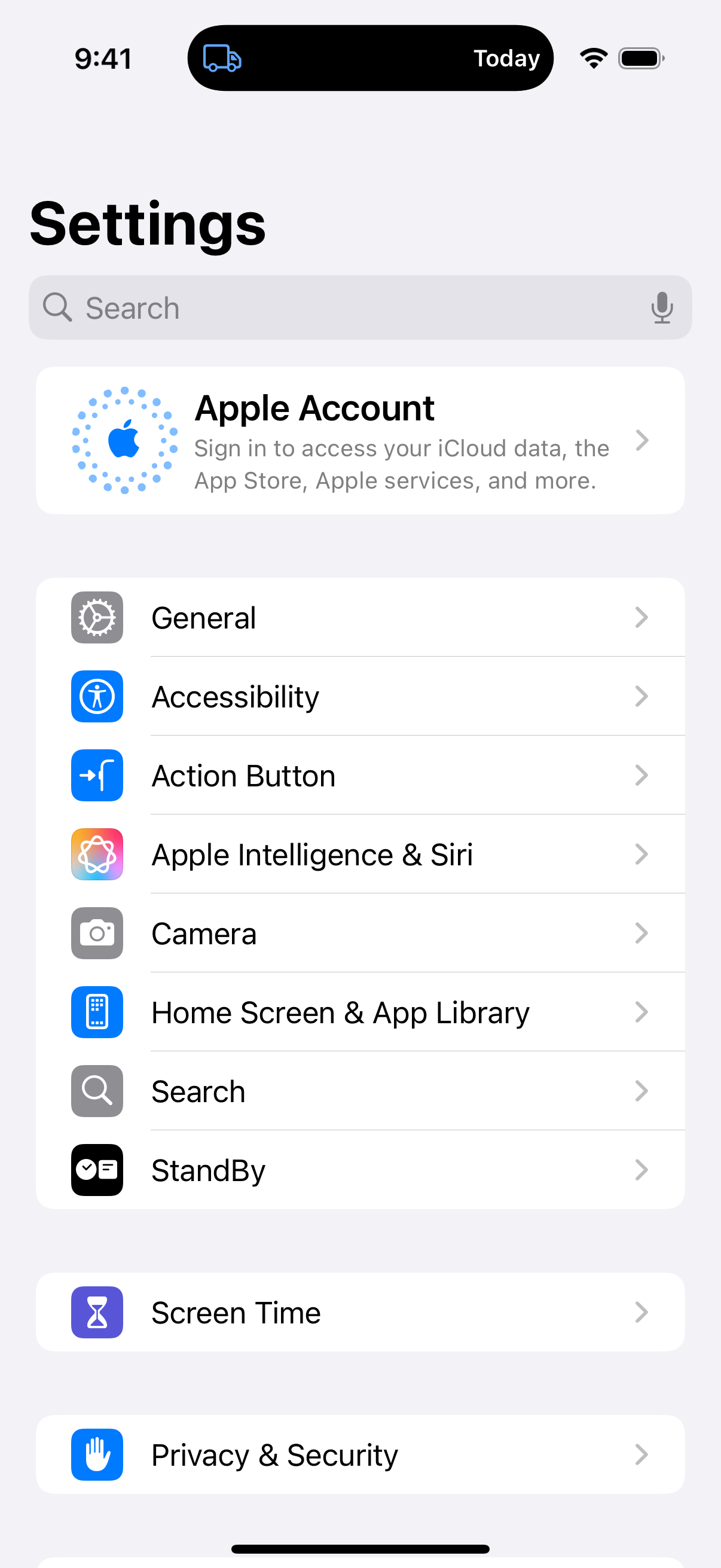
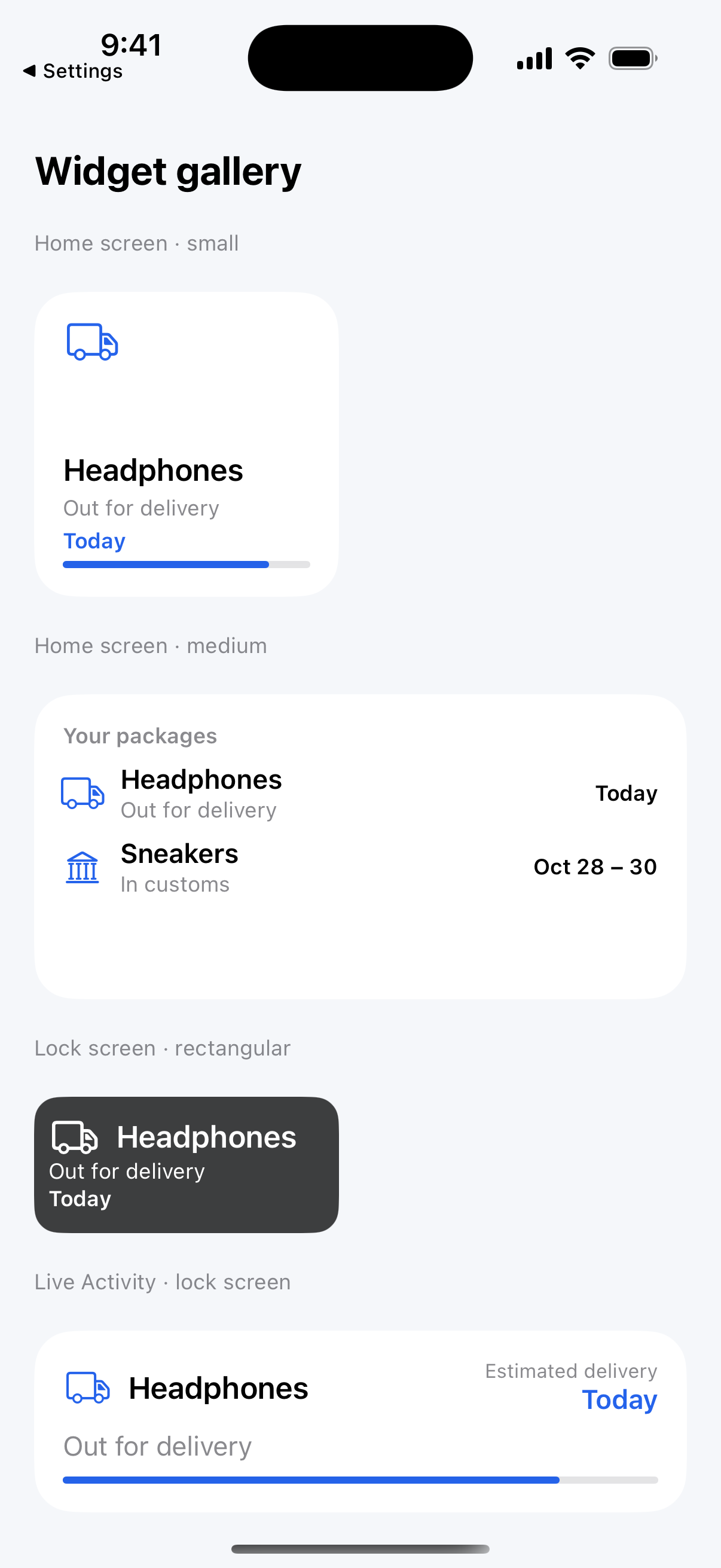
People check on a package in short glances, so the iOS app puts the answer where those glances happen: home and lock screen widgets, a Live Activity and the Dynamic Island, plus a share extension that tracks a number straight from another app. Android gets the same app as an installable build.
Every screen follows the device's light or dark setting. Switch between them below.
Showing it in two minutes
I scripted and produced a two-minute product demo that follows one real package from a confusing carrier page to a plain-language answer, then through customs, 45 languages, the route map, alerts and email forwarding.
The same footage feeds short vertical videos, each built around one worry and one audience: carrier jargon, customs-fee scams, families who read another language, and people who just want to watch their parcel cross the Pacific.
A plan for the first 90 days
A product people can't find doesn't help anyone, so I wrote a growth and funding plan for a solo student founder on a small budget. It starts with measurement, because every channel and every application depends on knowing whether people come back, and then covers positioning, a fair look at competitors, launch channels, funding paths and a 30, 60 and 90-day checklist built around the holiday shipping peak.
The plan itself stays private, but I'm happy to walk through it in an interview.
Measurement is now in place: cookieless page analytics plus server-side events for lookups, saved packages, sign-ins and alerts, with nothing personal stored.