A product nobody has seen before
Blendwright sells custom protein powder. Each customer picks what they take, and the site builds a formula for them: a protein base, a flavor and a set of add-ins, each at a dose the customer can see and change.
The hard part is trust. A custom formula is a product nobody has seen before, sold to someone who is about to put it in their body, so every choice the builder makes has to be explainable. The design question became: how do you make a personalized product feel precise and checkable, not like a quiz or a candy aisle?
I set four success criteria before designing anything:
- A first-time visitor understands the product within 10 seconds of landing on the home page.
- Every number on screen, from dose and price to protein per serving, updates visibly when the customer changes something.
- Every ingredient shows its reason and its evidence without leaving the builder.
- The site meets its accessibility and performance targets without trading one for the other.
Where the references leave a gap
I reviewed three direct competitors in custom protein. Their sites weren't reachable from my build environment, so I worked from their help pages and independent reviews and recorded every source.
All three cover the basics customers already expect, and I kept those: base choice, protein per serving, flavor with intensity, adjustable doses, bag size, a subscription option, a name on the label and a price that updates as you build. None of them explained why anything was in the bag.
| Approach | Entry point | Strength | Gap |
|---|---|---|---|
| Quiz-led | Questions about goals, diet and training | Easy to start | Personalizes by goal, not by what the customer actually takes |
| Pick everything | Choose every base, flavor and booster | Lots of control | Overwhelming, with no guidance on why to add anything |
| Calorie-first | Calorie or carb level, then protein | A clear entry point | Narrow framing around endurance |
Build from what they take
The formula assembles from the customer's own list instead of a goals quiz, so it answers a real question.
Evidence inside the builder
None of the references showed sources while you build. Every add-in gets a letter grade and a citation.
Visible safety rules
Doses stop at safe limits, and conflicting ingredients are blocked with a stated reason instead of disappearing.
Ten names, one maker
I screened ten candidate names against existing companies and products with exact-match searches. Two were cut: one because a supplement company already holds the trademark, and one because it was too generic to own.
Blendwright won because "wright" means maker, the name is distinctive, and screening turned up no company using it. Domain and trademark checks couldn't be finished from the build environment, so they stay on the open list, and the full shortlist is kept in the project so the choice can be revisited.
A label, not a product card
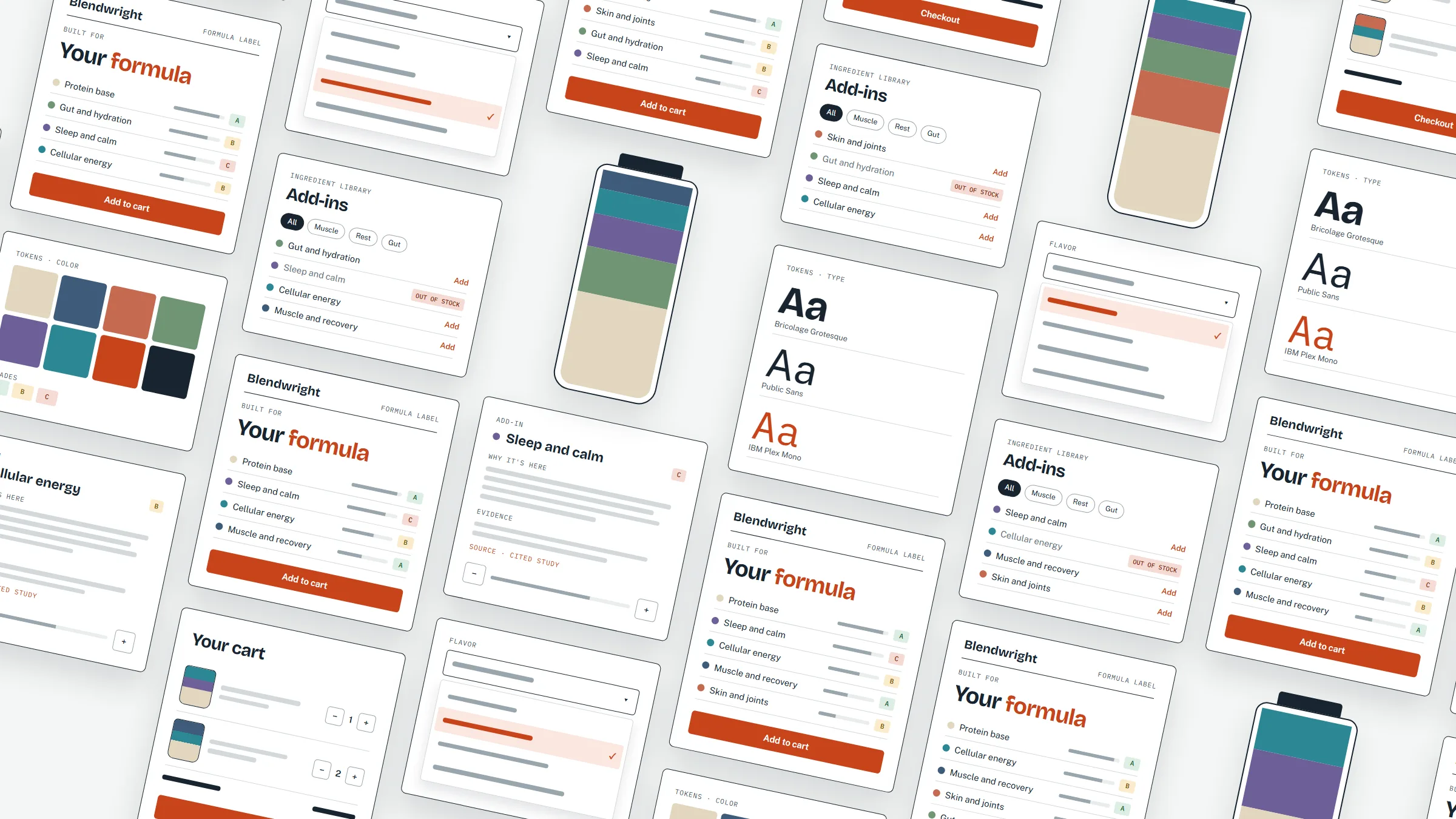
The most important decision was the metaphor. Supplement sites lean on product cards, bold color and athletes. Blendwright's live preview is a formula label: a printed record with the customer's name, each ingredient and its dose, and a nutrition summary. It reads like a dispensing record from a careful pharmacy, which is the promise: measured, not guessed.
The label is the center of gravity of the builder. It updates on every change, and the changes animate: rows slide in, amounts count to their new value, and the blend jar fills in proportion to each ingredient group.
Built for
Your formula
- Protein baseA
- Muscle and recoveryA
- Skin and jointsB
- Gut and hydrationB
- Sleep and calmC
Paper, ink and one vermilion
I wrote the direction down before building, so every later decision had something to be checked against. The anchor was a clinical-grade product label crossed with a kitchen scale, and explicitly not a sports supplement shop: no gradients, no hero athletes, no neon.
The page is paper and ink. The vermilion accent is reserved for actions and one emphasized word per page. Ingredient groups get their own six muted hues, used only in the blend jar and the ingredient list, so they never compete with the brand. During the audit one group's hue sat too close to the accent, so I moved it to the plum you see below. Evidence grades pair a letter with color, so color is never the only signal.
Mood
Precise. Calm, exact and legible, with every number traceable to a source.
Anchor
A clinical product label crossed with a kitchen scale.
Audience
Informed buyers who want to see the study before they buy.
Voice
Plain, specific and honest. The number first, then the reason.
Bricolage Grotesque
Headings, the wordmark and the formula namePublic Sans for reading, buttons and forms
Body copy, controls and navigationIBM Plex Mono · Evidence grade A
Only data and labels, cut from five styles to three rolesEvery color, size and space lives in one stylesheet as a named token, with no hard-coded colors in components. That made later fixes, like the plum hue and a type scale where two steps overlapped at some screen widths, one-line edits that carried through every page from 320 to 1440 pixels wide.
Decide, build, measure, look, change
I ran the work as a loop. Each round scored the built site against Nielsen's ten heuristics, scanned the copy for buzzwords, ran an automated accessibility engine on every page type in light and dark at desktop and mobile sizes, tabbed through the main pages to check focus, ran browser tests on the builder and the cart, and ended with a screenshot review of each page that set the next round of changes.
These are the calls that came out of it.
Replacing native dropdowns
The house rules forbid native selects, which draw their own chevron and handle the keyboard inconsistently. I built one shared listbox with arrow keys, Home and End, Enter or Space to choose, Escape to close and type-ahead. It keeps the old values and change events, so the builder logic didn't change.
Keeping out-of-stock items visible
Some ingredients couldn't be bought yet. Instead of removing them, I kept them in the library and marked them out of stock, so the range stays honest. Blends that depended on them fall back to their other ingredients, so every formula can still be completed.
Fewer choices
The builder had a base picker, a sweetener menu and eight flavors. I cut the base to one option, removed the sweetener choice and kept two flavors. Each remaining decision means more, and the label still reads as personal.
Hiding the batch reference
Every formula gets a deterministic batch code, so the same blend always matches its mixing record. It's useful on the printed bag but noise on screen, so it lives in the order details.
The example box that jumped
The home page rotates through example formulas of different heights, so the page kept changing length. Reserving the height of the tallest example keeps the page still.
Motion with a purpose
Motion is feedback, not decoration: controls respond to a press, nav underlines draw in, new rows slide in and adding to the cart gives a small bounce. All of it switches off for visitors who ask for reduced motion.
Ideas I set aside
Some of the most useful thinking happened in options I didn't ship.
- A goals quiz as the way in. Familiar and easy, but it personalizes by aspiration rather than by what someone actually takes.
- Flavors sold as separate packets. Simple to produce, but it breaks the idea of one formula per bag.
- A dark theme. The palette is defined, but the site ships light only. Keeping it defined leaves the option open without making visitors choose.
- A dropdown for every choice. Compact, but it hides the options. One accessible listbox replaced them.
- Autoplaying examples. I kept the rotation, but it stops the moment a visitor hovers or focuses on it, so it never fights someone who is reading.
Measured, not projected
Every number here was measured on the built site. The site hasn't launched to customers, so I haven't measured conversion or sales and I don't claim any.
- 0Accessibility violations across 44 automated runs
- 100Lighthouse accessibility, SEO and best practice on every page tested
- 0.34 to 0Layout shift in the builder
| Area | How it was measured | Result |
|---|---|---|
| Accessibility | axe on 11 page types, light and dark, desktop and mobile | 0 violations in 44 runs |
| SEO | Lighthouse and a crawl of every sitemap URL | 100; every URL returns 200 with a unique title, description and one H1 |
| Performance | Lighthouse, mobile and desktop | 97 to 100 |
| Interaction | Browser test suite for the builder and the cart | 16 of 16 pass |
| Contrast | Every text pair in light and dark | 4.5:1 or higher |
| Copy | Scan for dashes, buzzwords and title-case reflexes | None found |
What only people can tell me
The audits are good at finding inconsistency and broken rules. They can't tell me whether the builder feels trustworthy, so that comes next.
- Usability testing with five to eight people who take supplements, building a formula from a realistic list.
- Photography of the printed bag label, to make the formula metaphor physical.
- A full legal and content review before launch, with the design following that review rather than getting ahead of it.
- A screen reader pass on the listbox, beyond the automated and browser checks.
- A modular type scale and a documented component library, so the next designer can extend the system.
The strongest move was writing the direction down before building. Cutting options, the out-of-stock fallback, the label and the motion rules could all be checked against it, so the choices hung together. The weakest moment was the early builder, with too many choices and no clear hierarchy. If I did it again, I'd put the builder in front of real customers much earlier.