Who this is for
An agoraphobe can best be defined as a person with an extreme or irrational fear of entering open or crowded places, of leaving their own home, or of being in places from which escape is difficult. In a recent study by The National Institute of Mental Health, data was found to show that roughly 1% of the adult U.S. population struggles with this fear on a daily basis. In order to get a better understanding of this group, I conducted interviews with real patients of the disease, sourcing for pain points and daily struggles.
By far the most prevalent issue that was mentioned was the recurring rescheduling of important events, primarily doctor's appointments. Agoraphobes struggle to step outside the house unless they feel 100% safe in that decision, leading to a lot of last minute or in-the-moment rescheduling.
Additionally, doctor's offices and pharmacies were listed multiple times as dedicated "safe spaces" for patients, more than likely due to the presence of medical professionals. In order to make situations like this more desirable for the user group, I need to accommodate for this drawback of setting and spatial awareness. I plan to take both of these problems into consideration and create a neatly designed solution for my final project.
How I listened
I reached members of an agoraphobia support group through Instagram and asked three open-ended questions:
- What situations or environments outside your home feel most difficult or stressful for you, and why?
- Can you walk me through a recent experience where you needed to go out or interact with something, like an app, service or place, and it didn't go well?
- What would make it easier or more comfortable for you to do those same activities in the future?
Safety comes from people
Participants only felt safe with a trusted figure nearby, like a parent, partner or medical professional.
Safety changes day to day
Someone who can go to the store one day may not be able to leave the house the next.
Plans break at the last minute
Anxiety often holds steady until right before an appointment, then spikes, which leads to constant rescheduling and cancellations.
Two people, opposite ends of the spectrum
To keep the solution from fitting only one kind of patient, I wrote two personas from opposite ends of the user group. The wider the net, the more useful the final design would be.
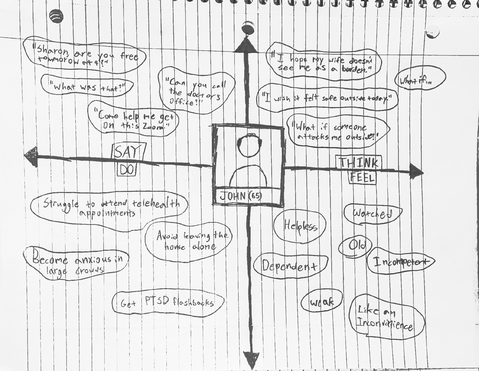
John Granger, 65, is a retired Navy veteran in Flatonia, Texas, whose agoraphobia followed PTSD from his service overseas. He sits at the milder end of the spectrum, but rheumatoid arthritis keeps him on a schedule of in-person check-ups, and he depends on his wife to drive him. One bad morning moves two people's plans and the doctor's.
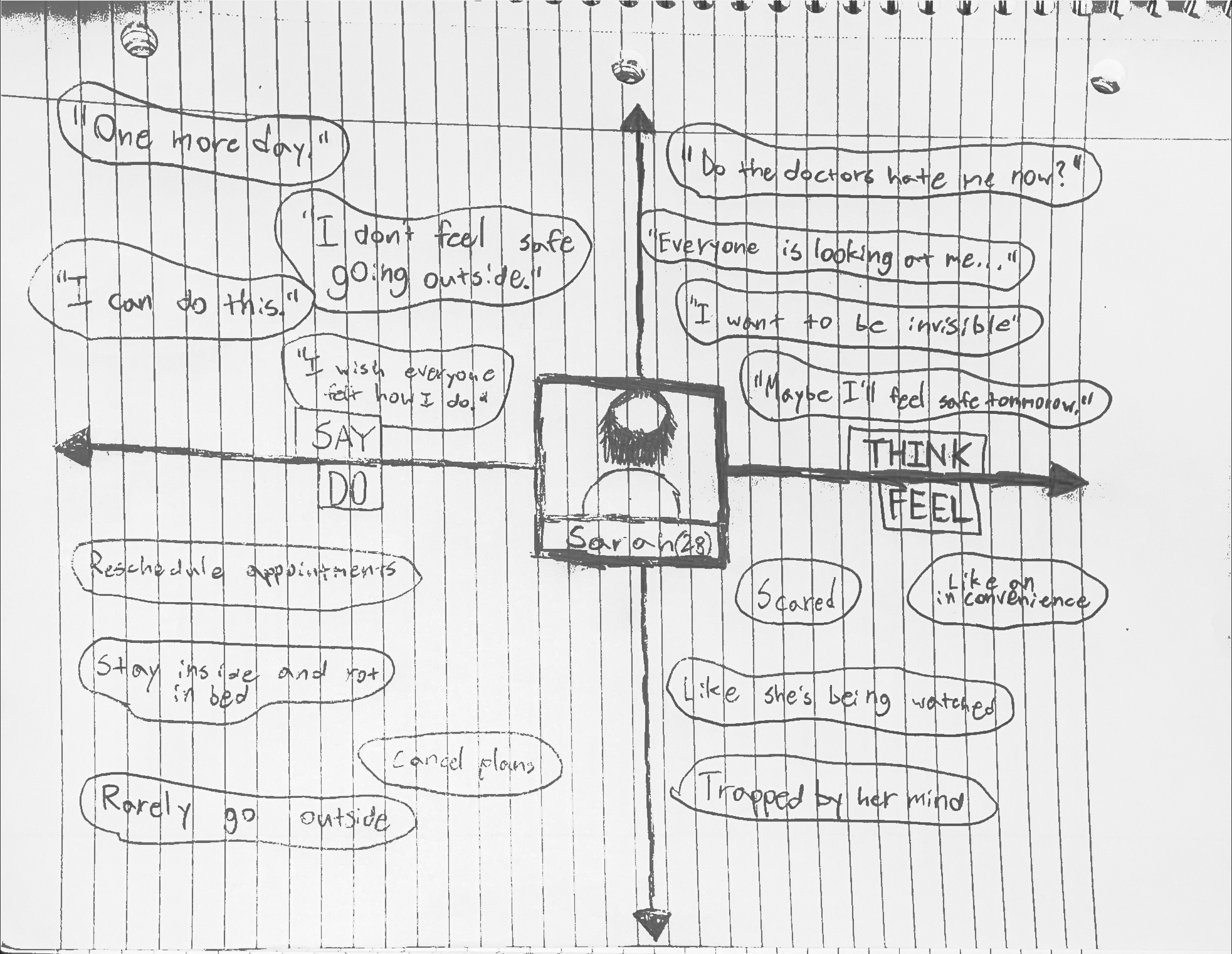
Sarah Harper, 28, is a freelance graphic designer living alone in downtown Austin, at the more severe end. She manages a secondary condition that needs regular visits, and her anxiety often peaks in the hour before she has to leave. When she reschedules, the next open slot is usually two weeks out, and a telehealth fallback can't check what she needs checked.
John Granger, 65Retired Navy veteran managing agoraphobia and rheumatoid arthritis.
Sarah Harper, 28Freelance graphic designer navigating agoraphobia from her apartment.
"Battled storms abroad, now just trying to brave the grocery store aisle."
What they say, think, do and feel
I mapped what each persona says, thinks, does and feels in the hours around an appointment. Side by side, the two maps showed the same pattern: both of them fully intend to go, and both feel the decision slipping away as the appointment gets closer.
That shifted the problem. Booking itself wasn't the hard part. The hard part was the moment just before leaving the house, so that moment is where FlexiDoc spends most of its effort.
Working it out on paper
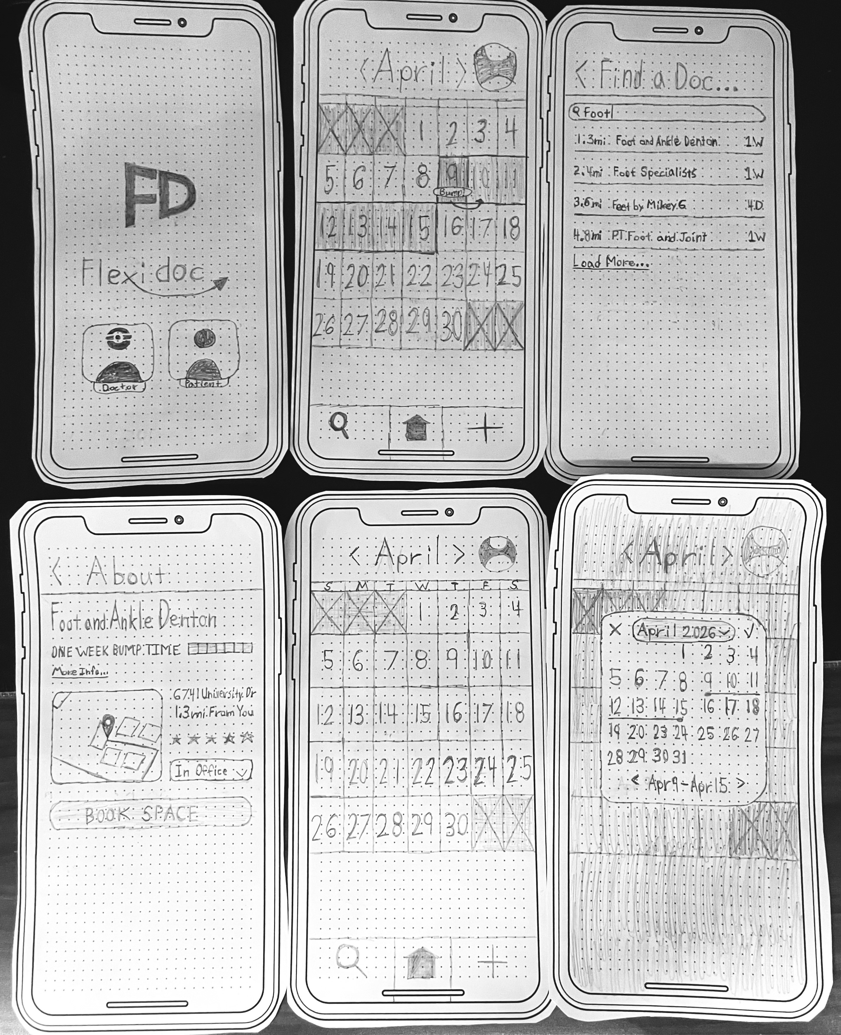
Before opening Figma, I drew the patient side of the app by hand: role selection, the home calendar, doctor search, an office's about page and the booking screens. Paper kept each round cheap and let me walk the flow screen by screen, in the order a patient would see it.
Walking it through exposed three problems that I carried into the next round:
- None of the screens said anything about time of day.
- The bottom bar combining search, home and add was inefficient and needed rework.
- First-time users needed more descriptive language to understand what each step did.
Two sides of one product
The information architecture plans both ends of FlexiDoc. From a single startup page, the app splits into a doctor flow and a patient flow. Doctors reply to messages, watch notifications and review bookings, which they can approve or deny. Patients work from a main calendar, search for providers, read an office's details and reviews, and book a space.
Account settings hold the profile along with disability preferences, so a patient's accommodations travel with them instead of being explained again at every visit. The main user flows are highlighted in red and green.
Following Sarah through the app
The journey map follows Sarah as she books a Wednesday 3 PM check-up and then bumps it. It moves through five stages, Calendar, Search, Information, Booking and Bump, and records what she does, what she's thinking and how she feels at each one.
Her mood climbs through search and booking, then drops hard at the bump, when the trip outside starts to feel unsafe. Every stage closes with its pain points and the change that answers them: a clearer icon and short explanation in place of the "Bump Time" label, larger date numerals with more contrast, sorting by rating and distance, and a count of open slots shown before the list.
"If I go outside today, everyone will watch me and something bad will happen."
Ten final screens
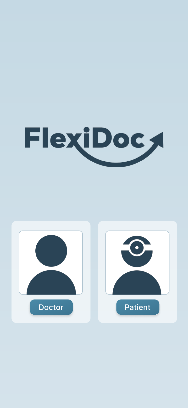
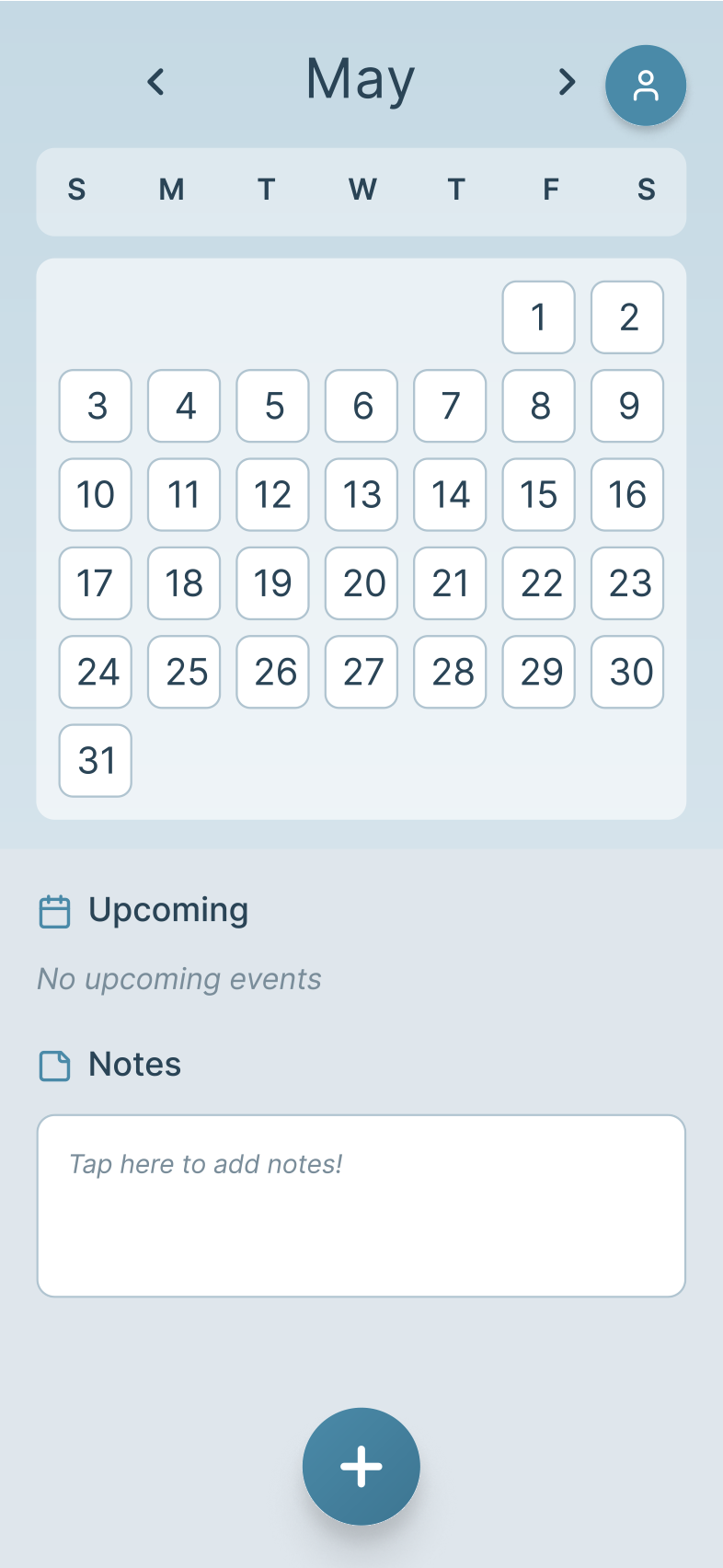
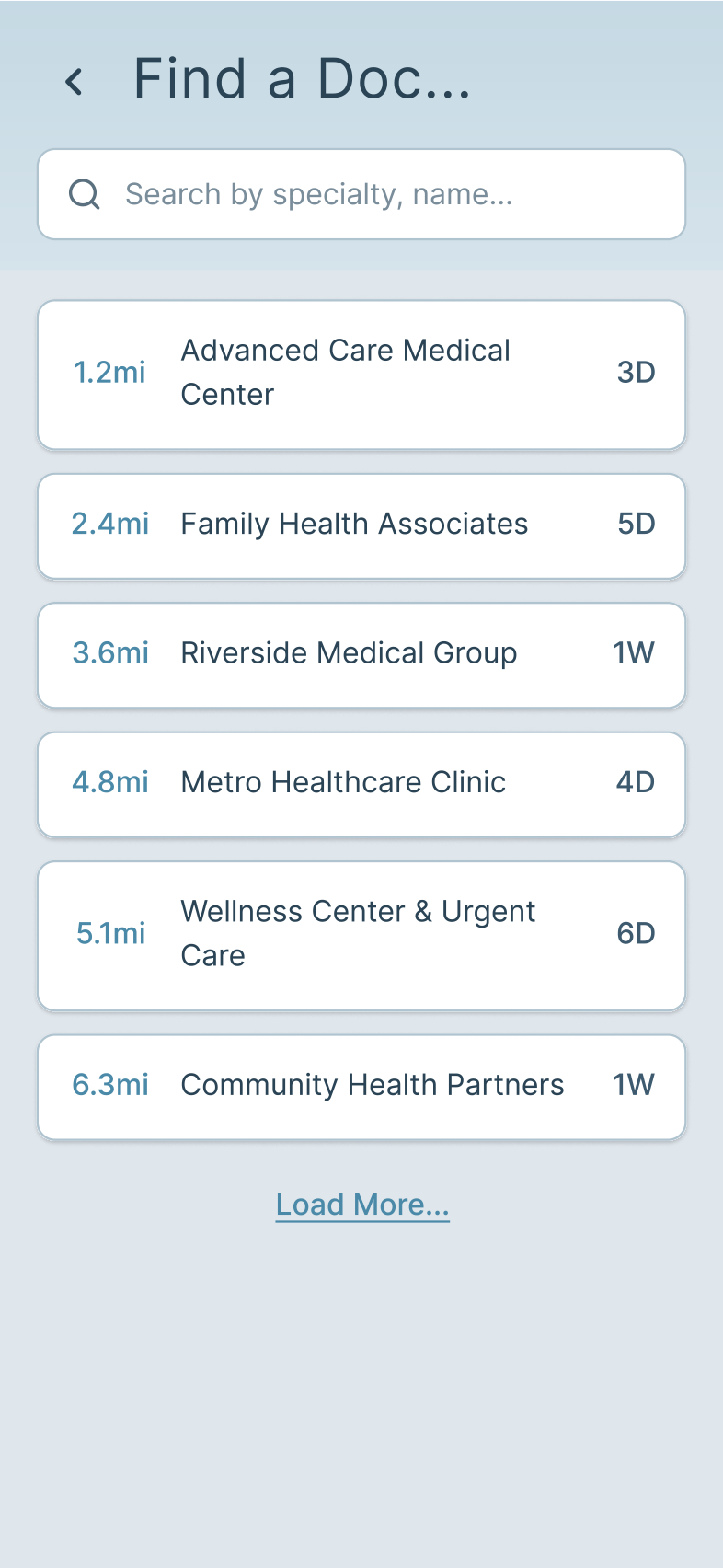
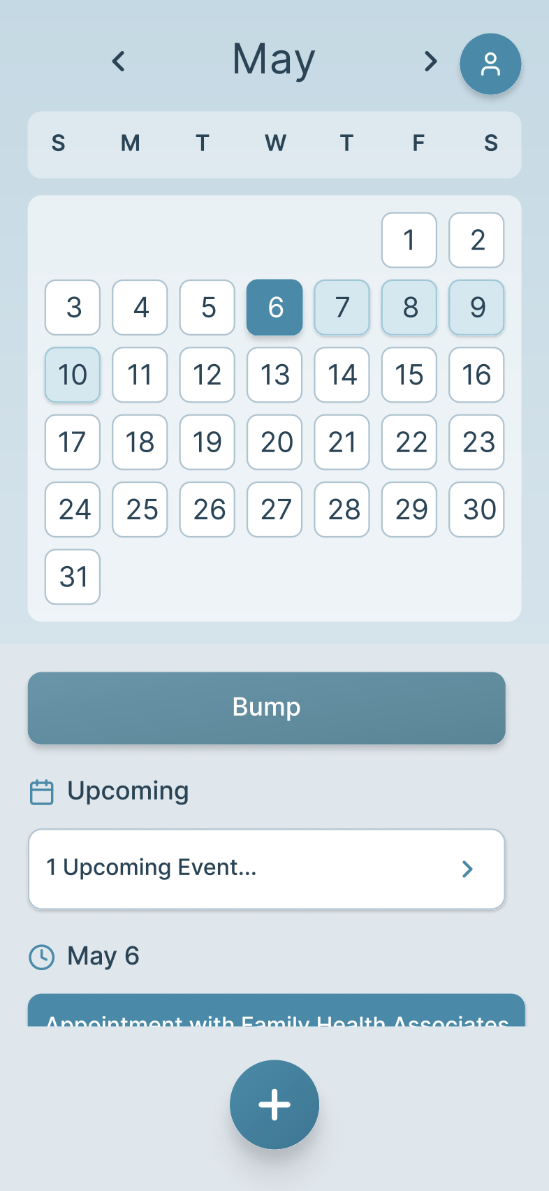
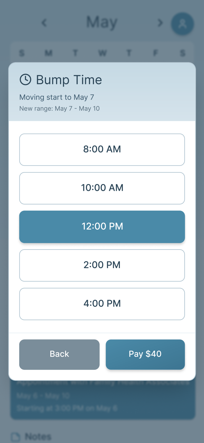
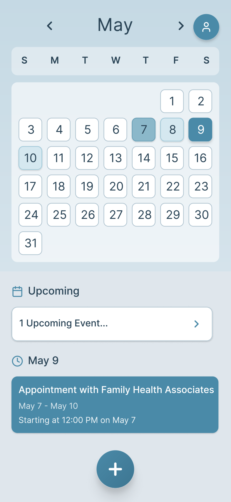
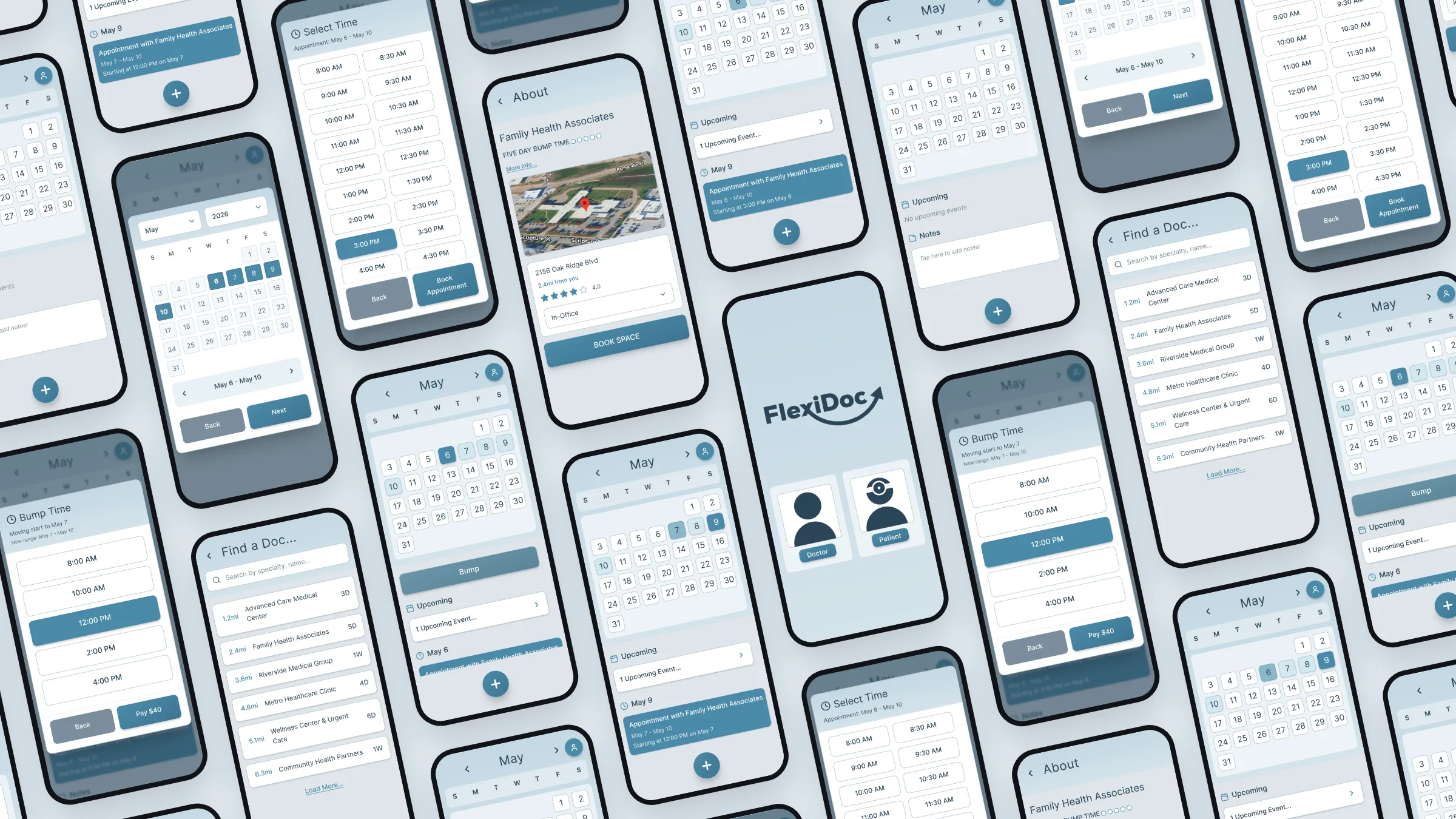
The high-fidelity screens in Figma cover the full patient path, from choosing a role on first launch to a bumped appointment back on the calendar. The palette stays in calm, low-saturation blues, the type runs large, and each screen has one clear next step, which keeps stimulation low for someone who may already be anxious when they open the app.
1. Choose a roleDoctor or patient, on first launch.
2. Home calendarUpcoming appointments and quick notes at a glance.
3. Find a doctorNearby providers by specialty or name, with booking windows.
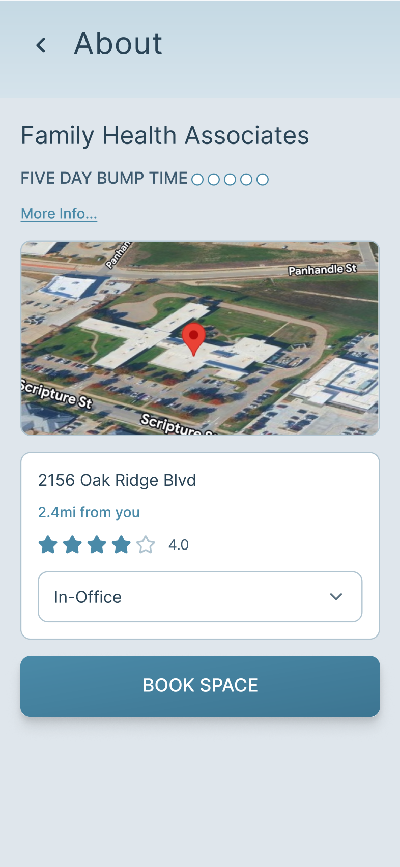
4. Office detailsLocation, rating and how the visit happens.
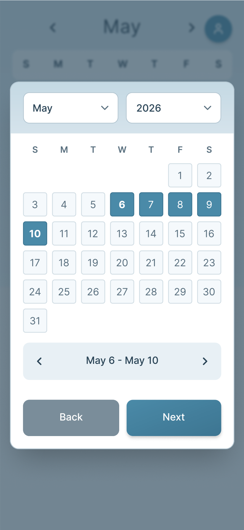
5. Booking windowThe multi-day window the office offers.
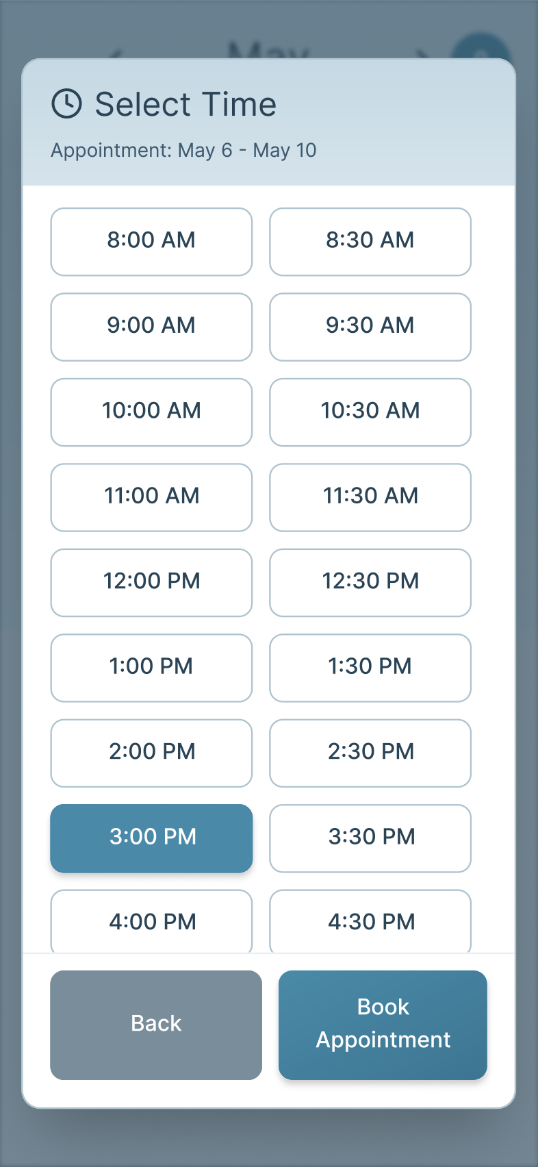
6. Pick a timeA specific slot inside that window.
7. ConfirmedThe appointment lands on the home calendar.
8. Start a bumpShift the appointment forward one day.
9. New time, reduced feePick the new slot and pay the bump fee.
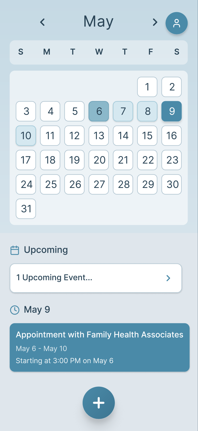
10. BumpedThe calendar shows the new range.
Try it yourself
Static screens only show so much, so I rebuilt the calendar as an interactive prototype in Figma Make. It runs right here: flip through the months, tap around the calendar, and try the plus button and the notes field the way a patient would.
Presenting to the faculty
I closed the semester by presenting FlexiDoc to the UX Design faculty. Over eleven slides the deck covers the user group, my research and the pain points it surfaced, both personas and their empathy maps, the solution, the site map, the journey map, the paper prototype and the final renders.
The title slide carried the whole idea in one line: appointments that wait for you, not the other way around.