It starts in a sketchbook
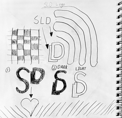
Every part of SLD began on paper. For the logo I worked through letter combinations and weights: S, L and D set side by side, dark and light versions of a joined S and D, and the letters pushed against a checkerboard and a speaker-style arc.
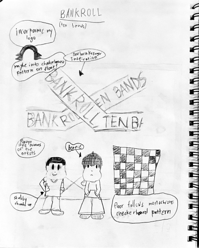
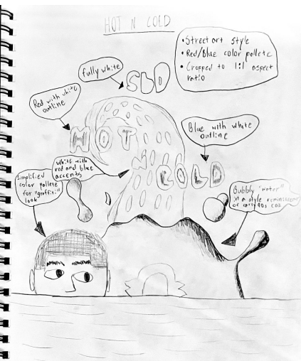
The cover sketches did the same job for single releases. Bankroll played on the "ten bands" line, pairing the title with a checkerboard pattern and two cartoon figures. HOT N' COLD planned a streetwear look in red and blue with puffy white outlines, so the color story was settled before the final artwork started.
One mark, any background
The final mark folds the S, the L and the D into a single glyph. It stays legible as a small streaming thumbnail and holds its shape on top of the busiest artwork, which mattered for an artist whose covers change style from one release to the next.
Around the mark I wrote a one-page style guide that names the look, Y2K digital naive: early-2000s web nostalgia, MS Paint and pixel art, and streetwear cutout collage. It fixes a five-color core palette and lists what to do and what to avoid, such as keeping contrast high and staying away from muted earth tones and polished glassmorphism.
Fifteen covers, one artist
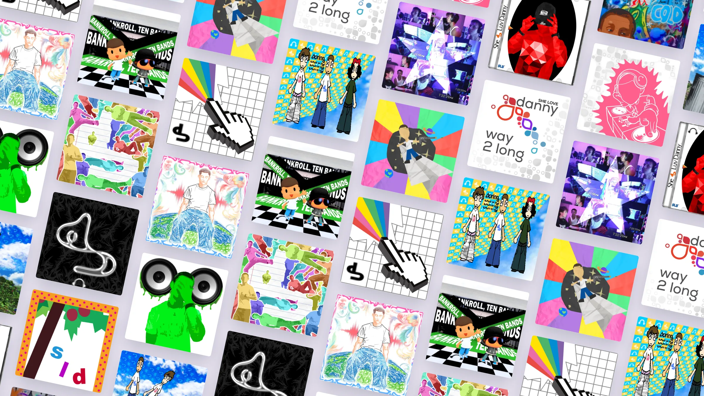
Each single gets its own cover built around the tone of the track, held together by the mark and the palette. The styles move from pixel art to collage to photography, and the brand still reads the same from one release to the next.
Pick a cover to hear the song it belongs to. The visualizer takes its colors from whichever cover is playing.